Cuppa
Cuppa
Cuppa
Cuppa
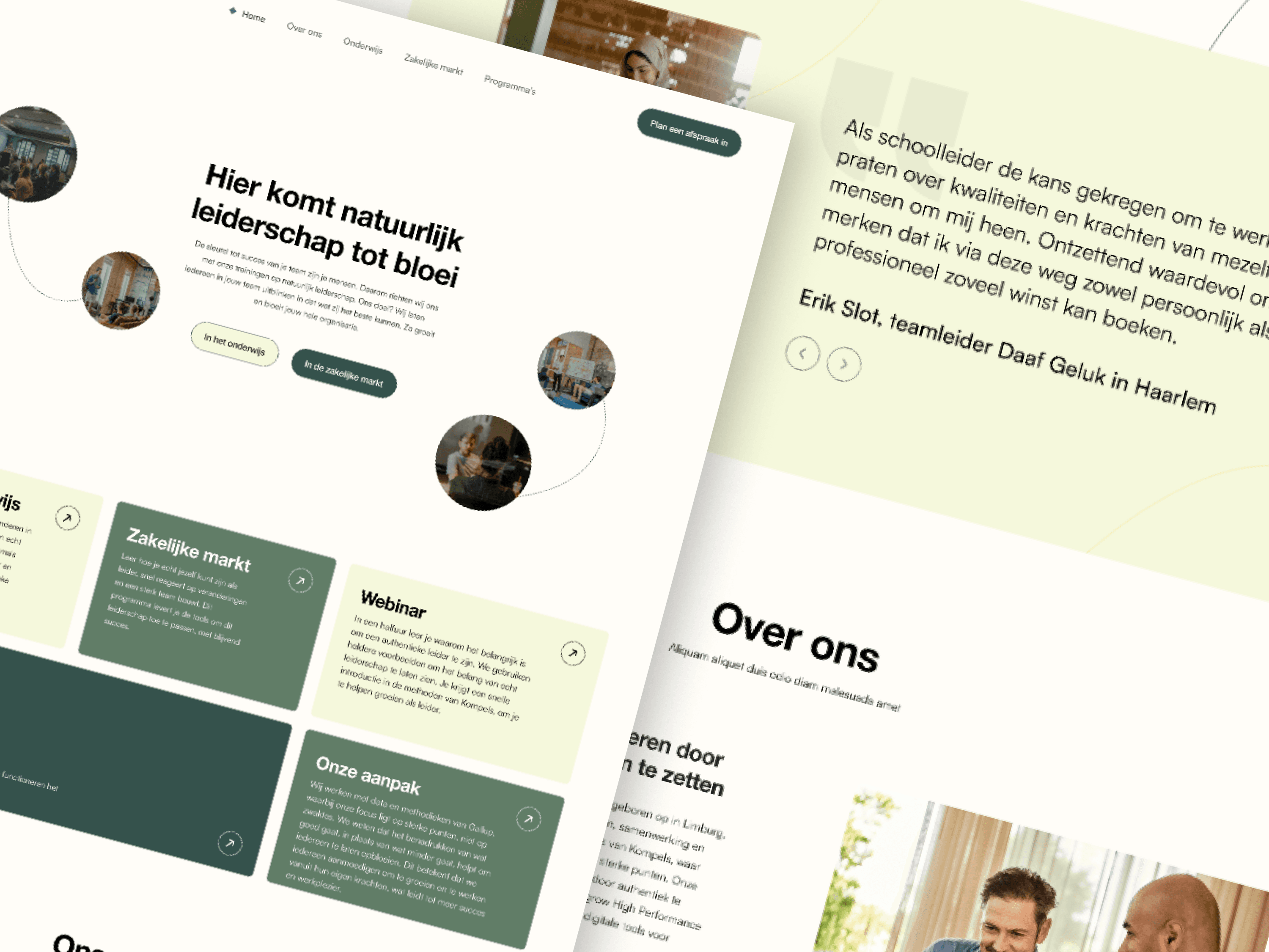
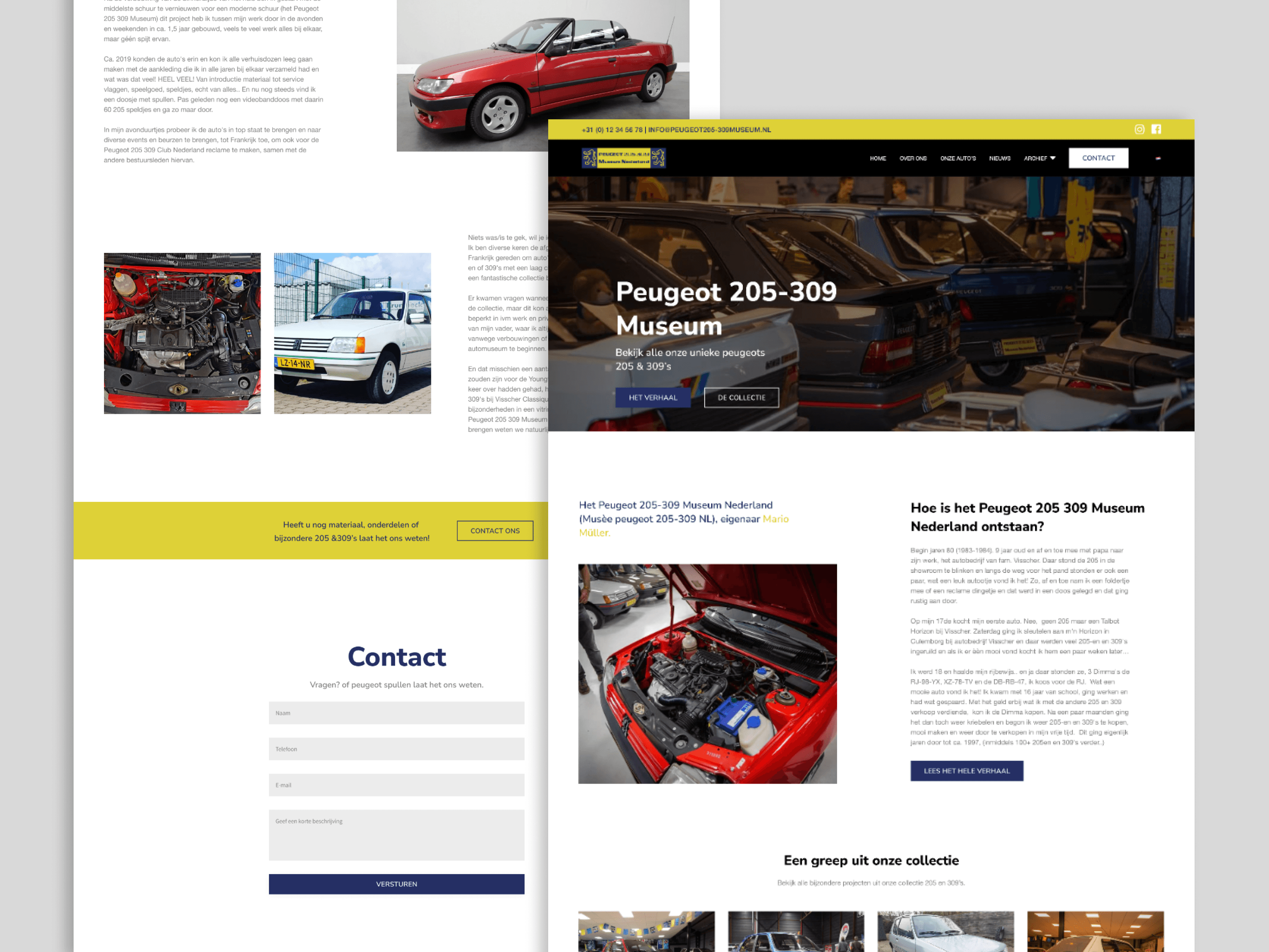
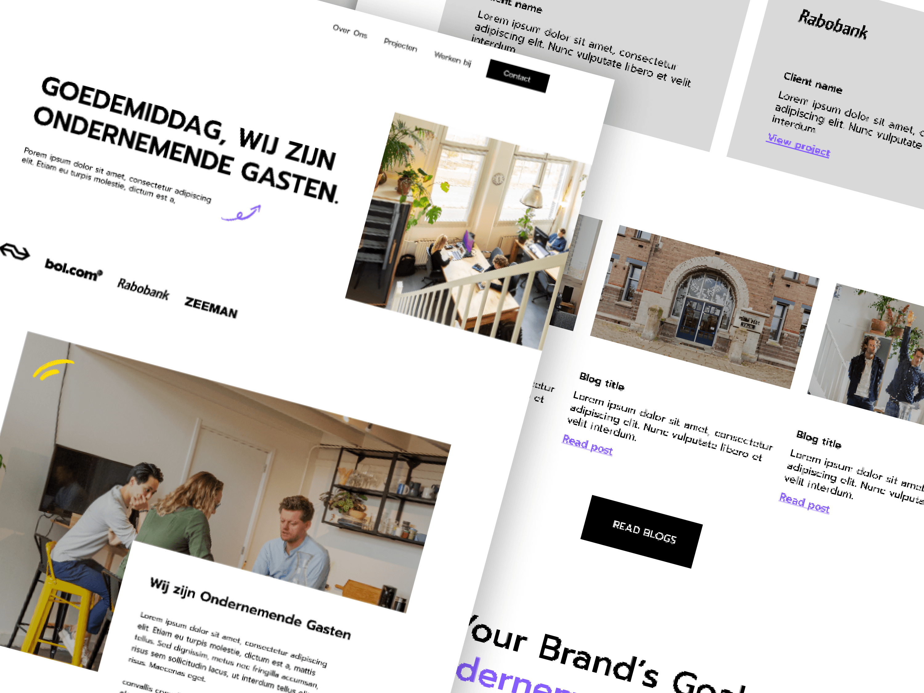
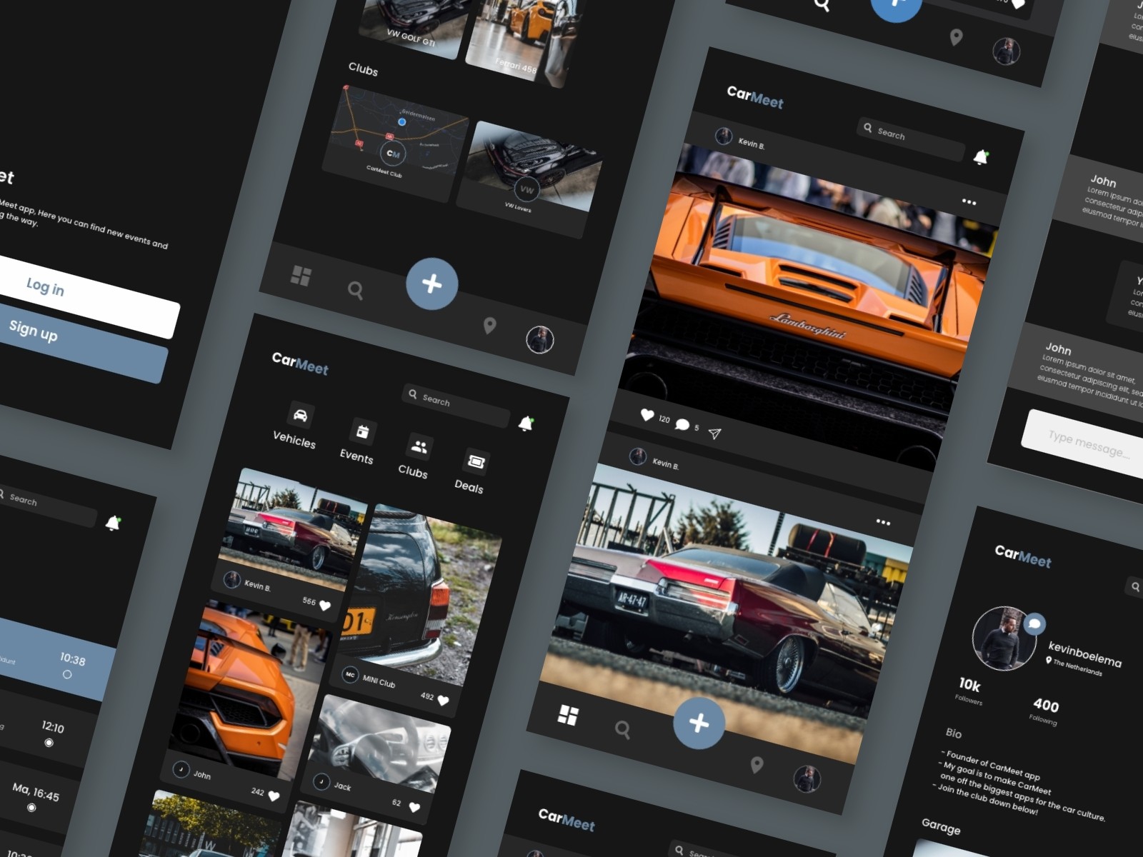
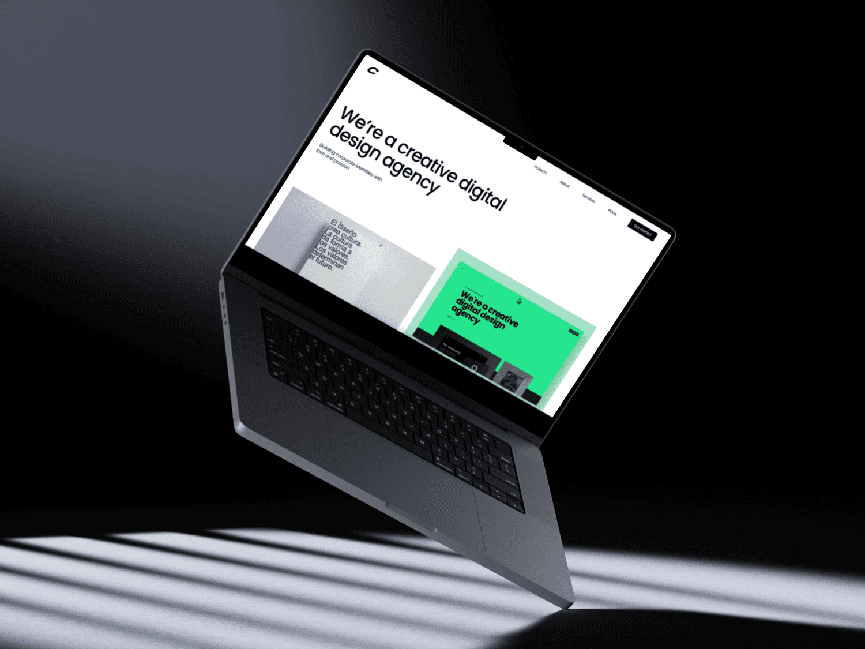
Embarking on a redesign journey, design agency's website transformation seamlessly blends aesthetics and functionality. Through intuitive navigation, captivating visuals, and streamlined user experiences, the revamped site not only showcases our creative prowess but also offers visitors an immersive journey into the dynamic world of design innovation.
Embarking on a redesign journey, design agency's website transformation seamlessly blends aesthetics and functionality. Through intuitive navigation, captivating visuals, and streamlined user experiences, the revamped site not only showcases our creative prowess but also offers visitors an immersive journey into the dynamic world of design innovation.
Embarking on a redesign journey, design agency's website transformation seamlessly blends aesthetics and functionality. Through intuitive navigation, captivating visuals, and streamlined user experiences, the revamped site not only showcases our creative prowess but also offers visitors an immersive journey into the dynamic world of design innovation.
Embarking on a redesign journey, design agency's website transformation seamlessly blends aesthetics and functionality. Through intuitive navigation, captivating visuals, and streamlined user experiences, the revamped site not only showcases our creative prowess but also offers visitors an immersive journey into the dynamic world of design innovation.
00
00

00

00

problem
The design agency's existing website faced challenges of outdated user experience and inconsistent branding. Navigational complexities and a lack of coherence in visual elements hindered the site's ability to effectively communicate the agency's modern and innovative design approach.
solution
To address these issues, the design agency initiated a comprehensive redesign strategy. The user interface was overhauled for optimal navigation, ensuring a seamless and engaging experience. Simultaneously, the visual elements were aligned with a cohesive and contemporary brand identity, reflecting the agency's commitment to cutting-edge design. The redesigned website now harmonizes aesthetics and functionality, providing visitors with a captivating and intuitive platform that truly represents the agency's creative prowess.
Brewing Brilliance: Cuppa Design Agency's Website Redesign Tale
In the heart of the bustling digital landscape, Cuppa Design Agency found itself at a pivotal moment, recognizing the need for a transformative journey. Their existing website, while once a showcase of creativity, was showing signs of aging. It was time for Cuppa to embark on a redesign tale that would not only revitalize their online presence but also mirror the innovation they brought to their clients.
1. The Awakening: A Sip of Inspiration
The story began with a collective realization among Cuppa's design wizards – their virtual storefront needed a fresh coat of digital paint. The team, fueled by steaming mugs of inspiration, sat down to envision a website that would not just speak but sing the language of design excellence.
2. Ideation and Sketches: Crafting the Perfect Blend
Armed with sketchbooks and an abundance of creative energy, Cuppa's designers embarked on the ideation phase. They envisioned a website that echoed the agency's commitment to innovation and bespoke design solutions. Sketches turned into wireframes, each line and curve a carefully plotted route through the digital realm.
3. A Splash of Color: Infusing Vibrancy
The color palette became the next canvas for Cuppa's artists. Rich hues reminiscent of the varied blends in a coffee roastery were chosen to infuse vibrancy and life into the digital space. The website wasn't just a canvas; it was a masterpiece, a testament to Cuppa's ability to blend colors, shapes, and ideas seamlessly.
4. Coding Symphony: Brewing Digital Magic
As the vision solidified, Cuppa's developers wove a coding symphony, translating design dreams into digital reality. Responsive design ensured a flawless experience on devices of all sizes, and interactive elements added a layer of engagement, turning each click into a delightful surprise.
5. User-First Navigation: A Seamless Pour
Recognizing that user experience was paramount, Cuppa placed navigation at the forefront. The redesigned website flowed seamlessly, inviting visitors on an intuitive journey through the agency's portfolio, services, and the rich tapestry of their design philosophy.
6. Unveiling the Elegance: A Digital Brewmasterpiece
The day arrived when Cuppa Design Agency unveiled its digital brewmasterpiece to the world. The homepage, an inviting aroma of creativity, greeted visitors, and each click led to a new revelation. The portfolio pages were galleries, showcasing not just designs but the passion and stories behind each project.
7. Sip by Sip: User Engagement Grows
As visitors poured in, engagement flourished. The redesigned website became a hub where potential clients immersed themselves in Cuppa's creativity. Contact forms were filled, inquiries brewed, and the digital aroma of success lingered in every pixel.
8. Beyond the Brew: A Continual Pour of Innovation
The story doesn't end with the redesign; it's an ongoing narrative. Cuppa Design Agency continues to pour creativity into their website, ensuring it remains a living, breathing testament to their commitment to design excellence. The website redesign wasn't just a digital facelift; it was a declaration that Cuppa's creativity knows no bounds, and their online presence is as vibrant as the designs they craft for their clients.**
year
2023
timeframe
1 Month
tools
Figma - Framer
category
Branding and Identity
